A complete overhaul of the identity and the website
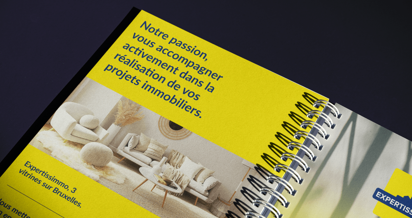
Expertissimmo called on ergonomic to redesign its identity and website. Active for more than 40 years throughout Brussels, Expertissimmo has 3 large showcases in the Brussels region.

Boosting the brand, while honoring its heritage.
The research challenge was to keep the characteristics of the old logo while re-energizing the brand.
A bright yellow that stands out
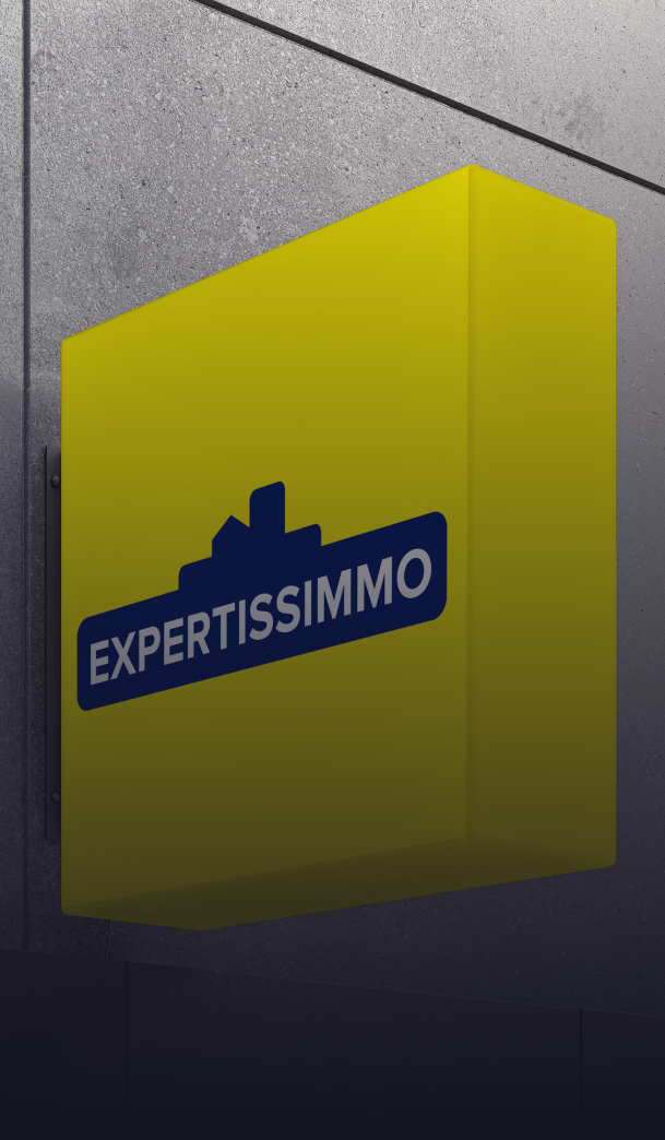
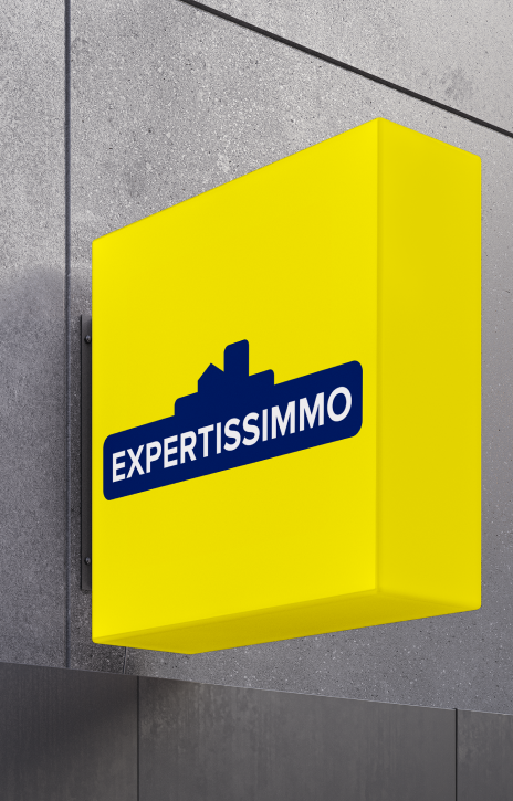
Particular attention was paid to the current characteristics of the logo, its bright yellow and its buildings in the background. This bright main color allows Expertissimmo on the one hand to stand out from its competitors, and on the other hand to be easily recognized. It was important for Expertissimo to keep this feature.
Improve readability
In order to improve the legibility of the logo while keeping the characteristic yellow background, the solution proposed and chosen was to reduce the size of the yellow background in relation to the brand name. The ideal compromise.
More flexibility
The idea was also to be able to use the logo on a support with a background corresponding to the primary color of the logo. A very useful application for many media.
Complete redesign of the website
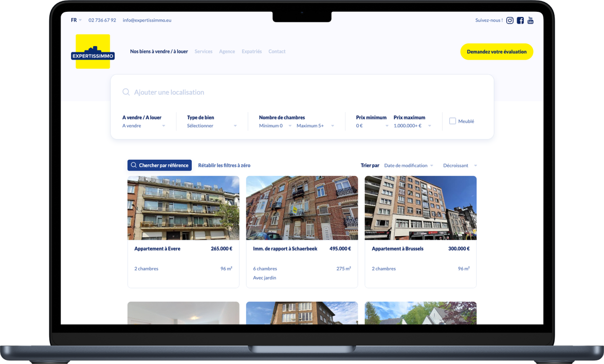
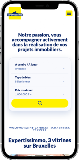
The website has been completely redesigned to reflect the new brand. The numerous services of the 3 agencies are clearly presented, and the properties for sale and for rent are easy to find according to the visitor’s criteria.
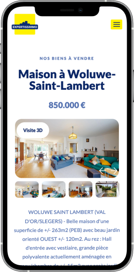
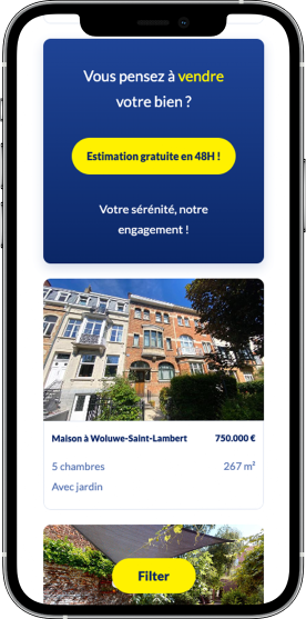
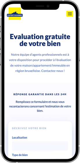
A simple, clear and structured presentation
Each property is carefully presented, and the information structured efficiently for an overview at a glance.
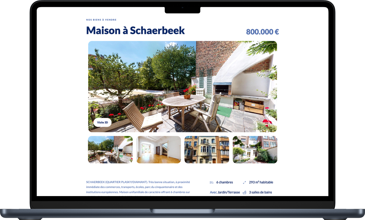
Linked with Whise for property publication management
The site is fully linked to Whise, the property management program used by Expertissimo. Members of the sales team can manage properties directly on Whise and send them to the website with one click.
